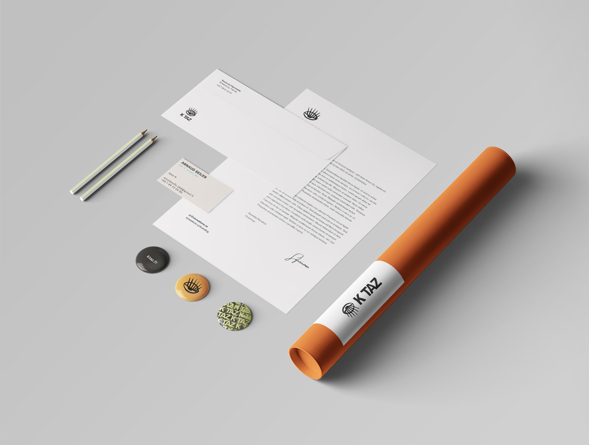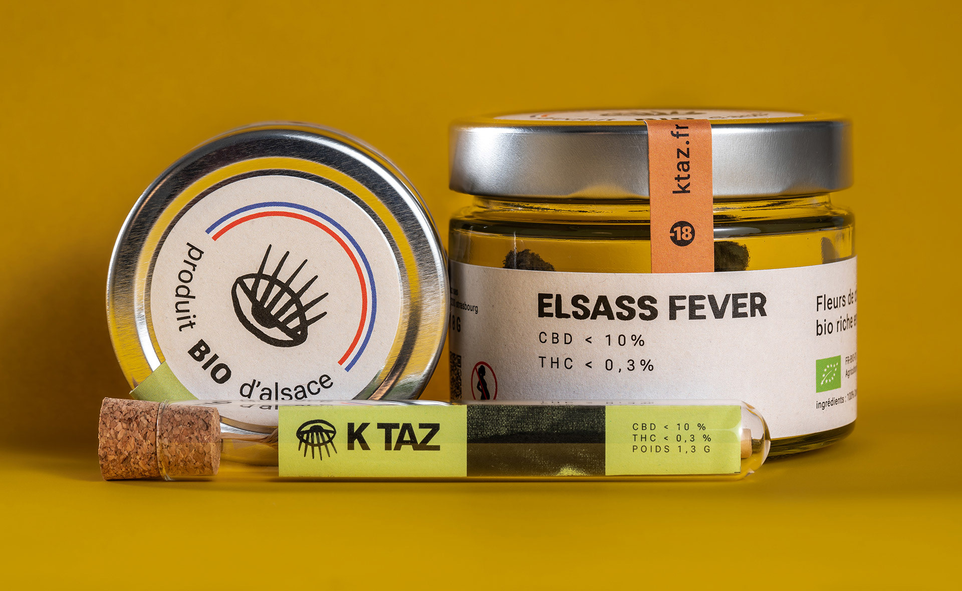
Alsace-based KTAZ, specialists in organic CBD production, approached me to design a versatile brand identity. Addressing both the seasoned user and the potential new consumer, the new brand voice is serious, yet friendly.
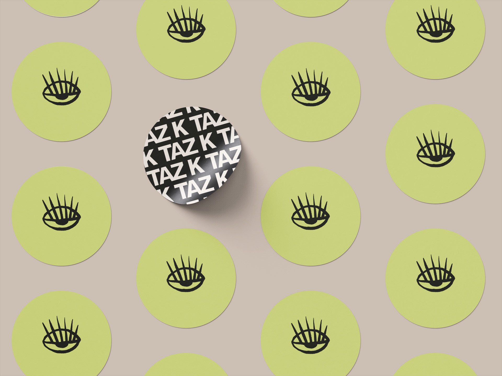
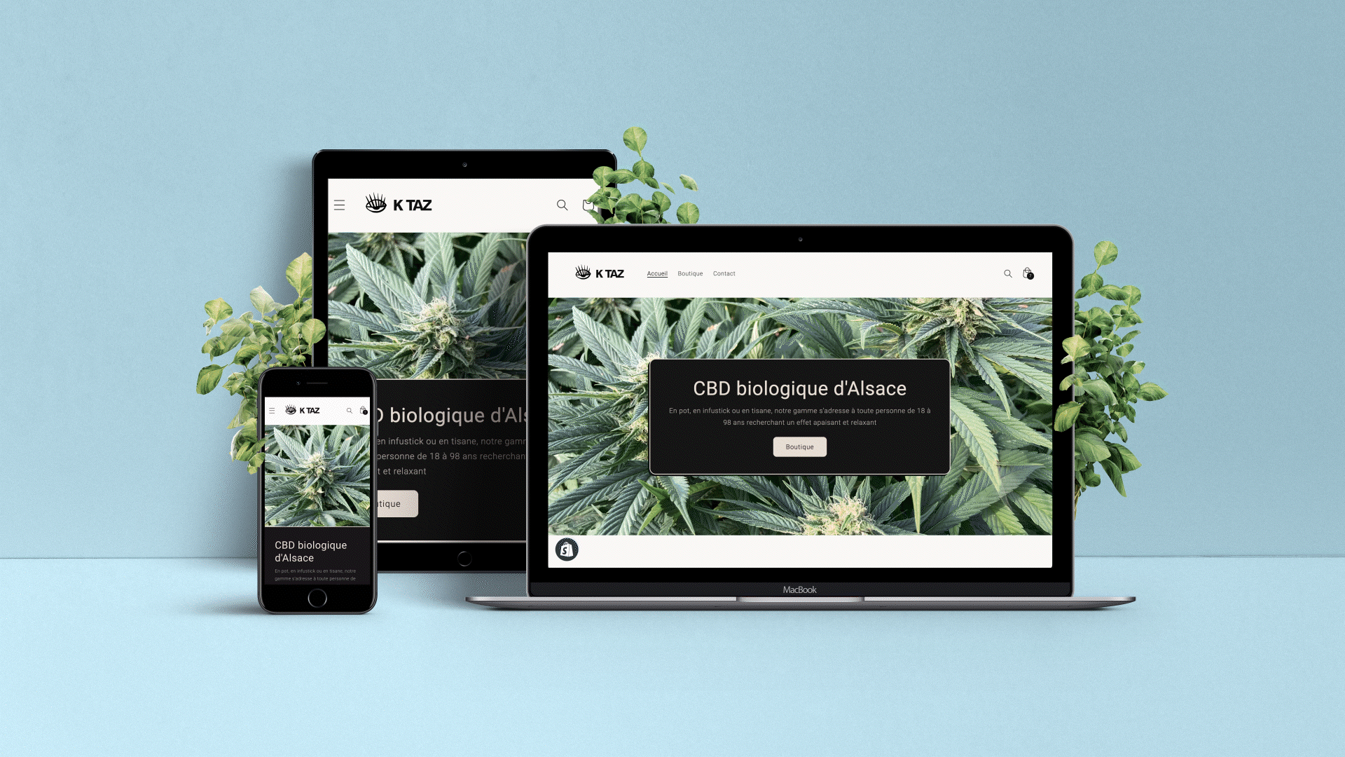
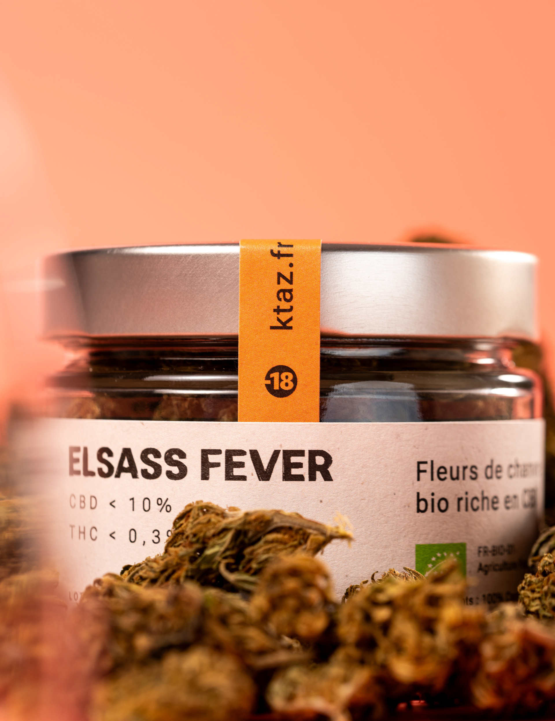
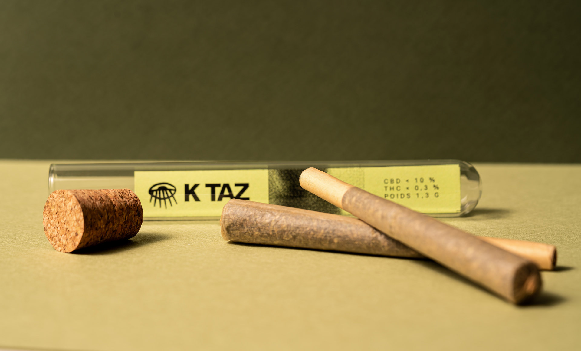
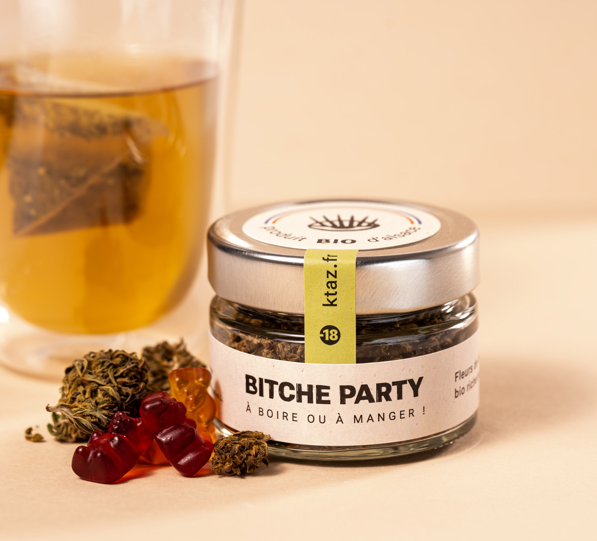
These various branding elements were to be deployed on a multitude of print and digital media, including packaging elements, flyers, stickers, social media content and an ecommerce website.
These various branding elements were to be deployed on a multitude of print and digital media, including packaging elements, flyers, stickers, social media content and an ecommerce website.
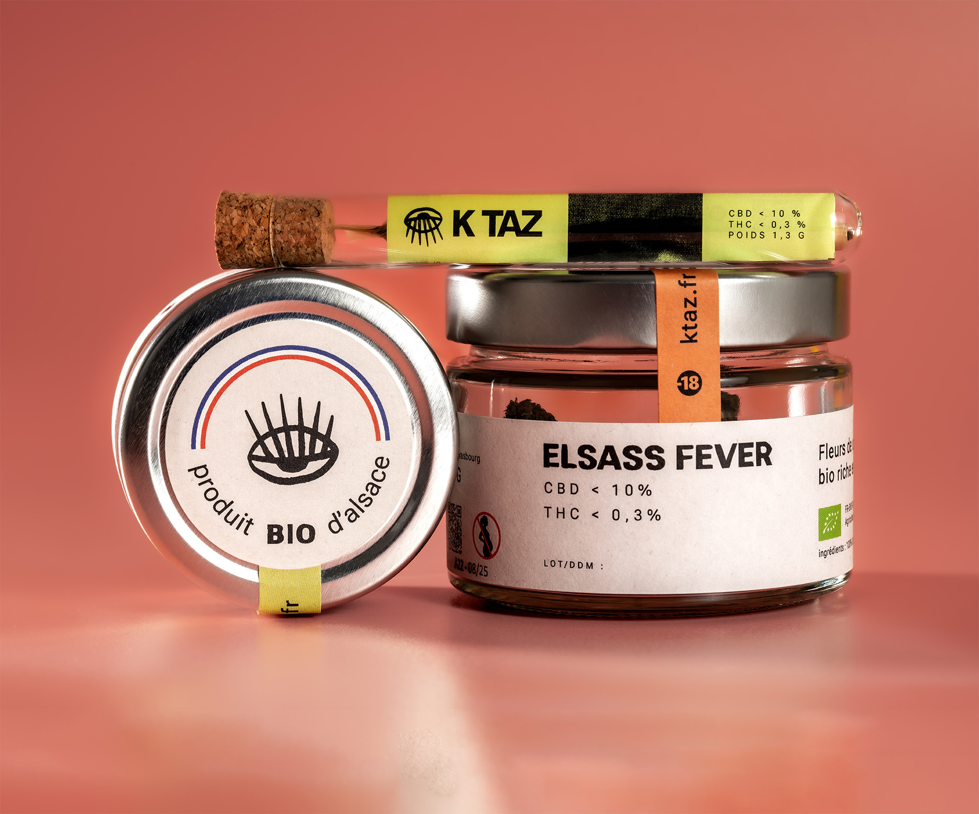
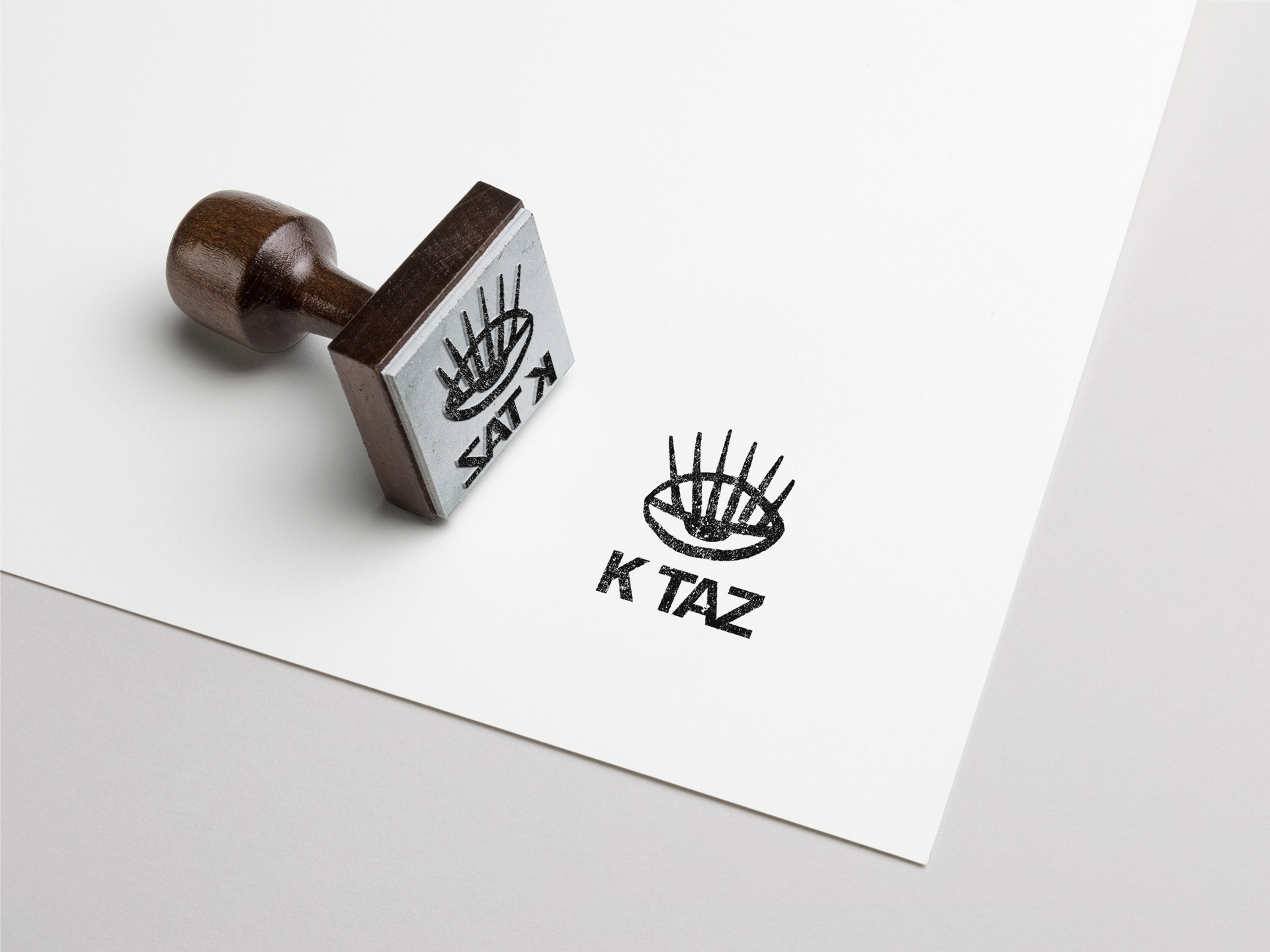
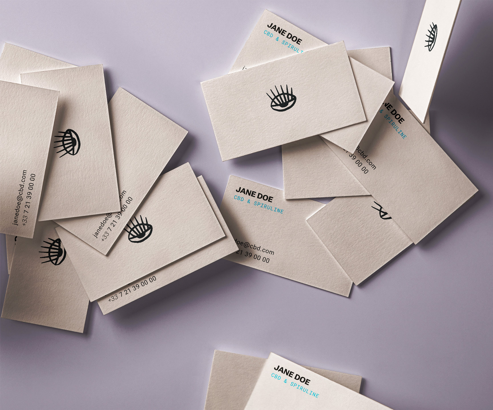
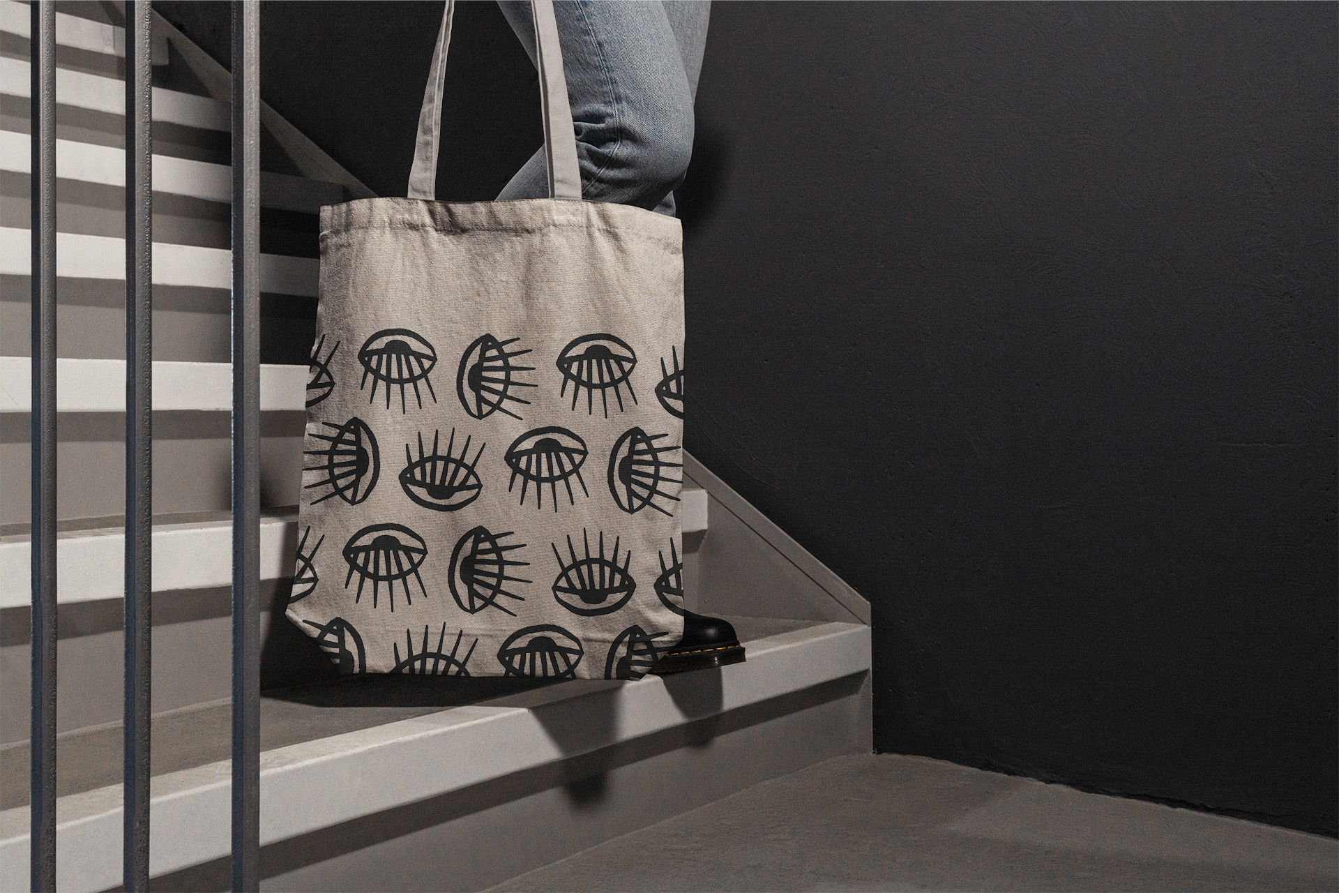
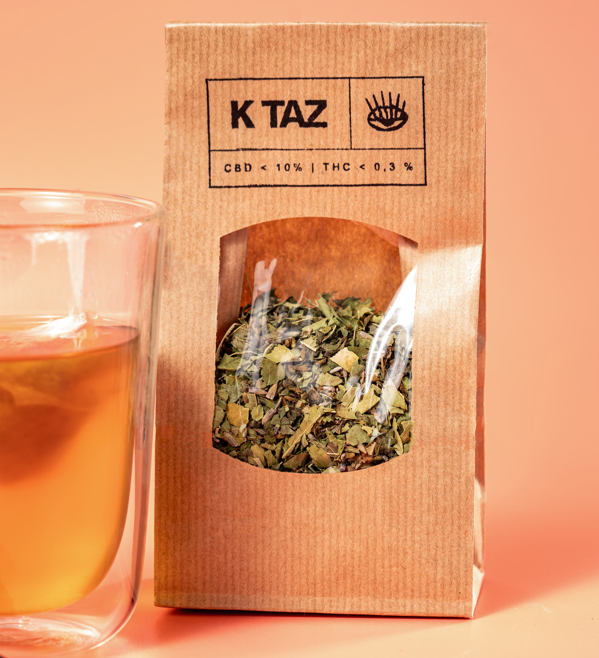
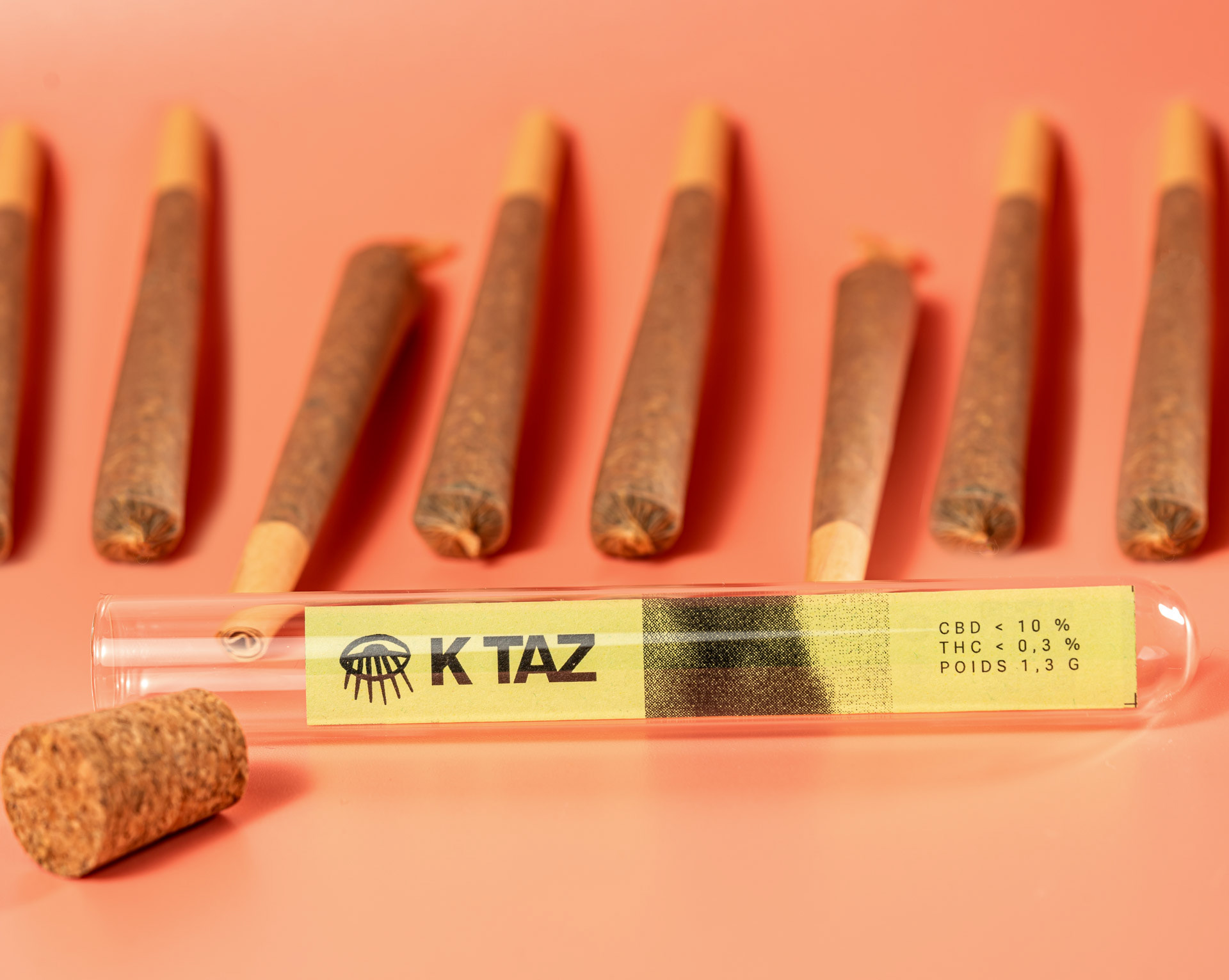
Featuring an icon with high recognition potential and the brand's name, the logo is versatile and easy to read. These qualities are essential when printing on low-cost or rough materials such as kraft paper. A universal symbol of approach and understanding, the eye establishes a direct connection with the consumer. Its bold style and half-closed design emphasise the natural, relaxing qualities of the products.
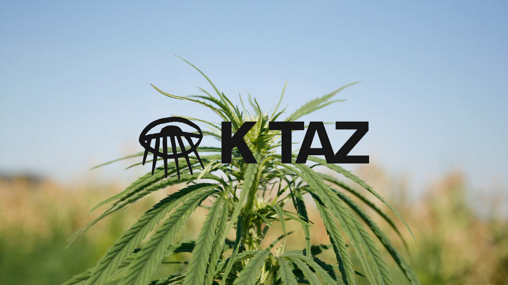
Logo on picture of plant
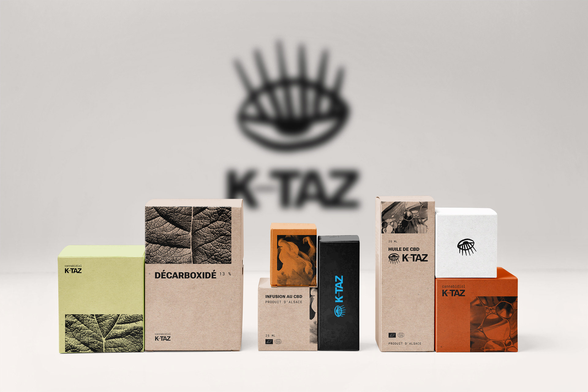
Packaging for KTAZ
© Margot Moïo
© Margot Moïo
© Margot Moïo
© Margot Moïo
© Margot Moïo